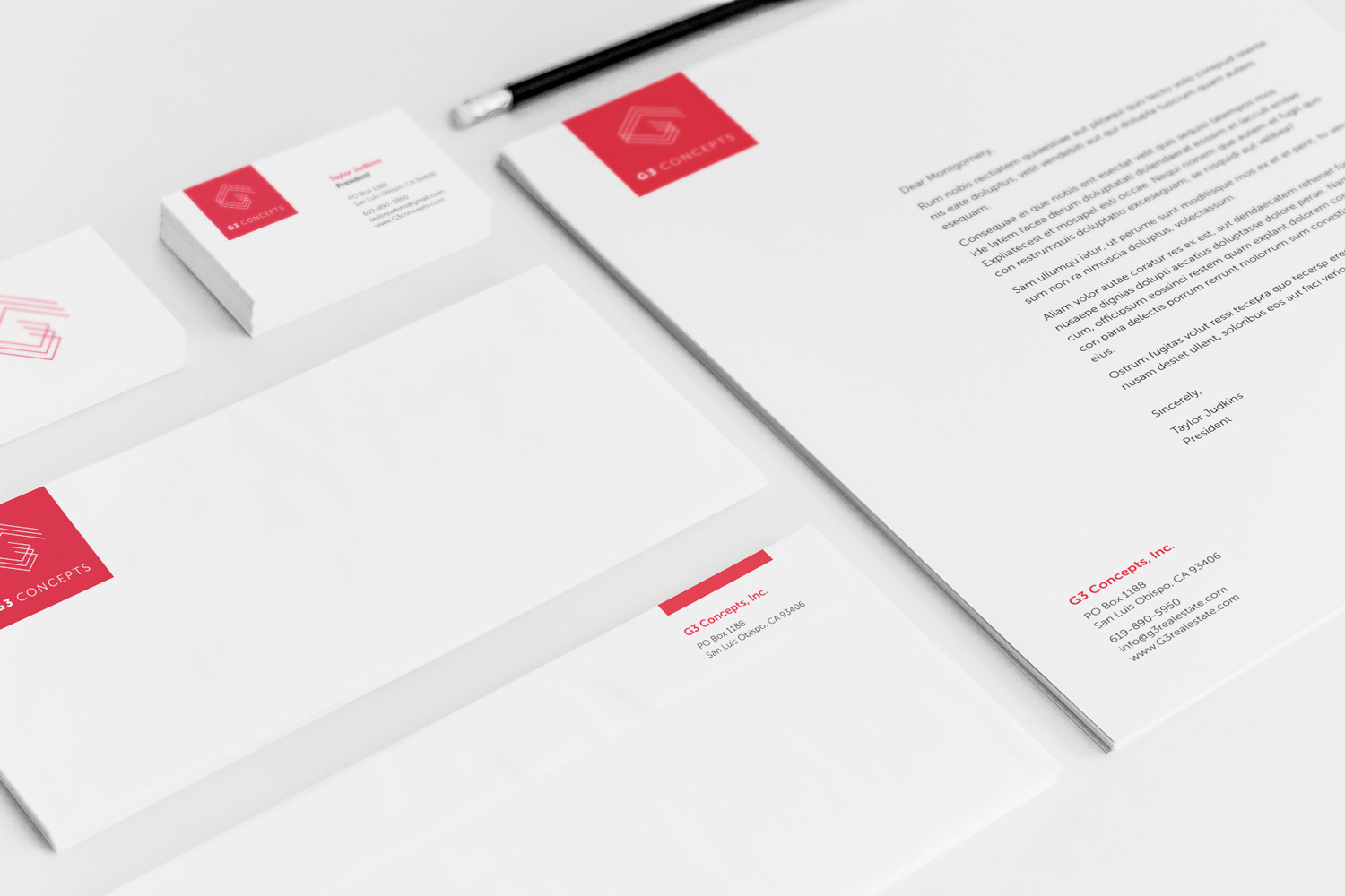
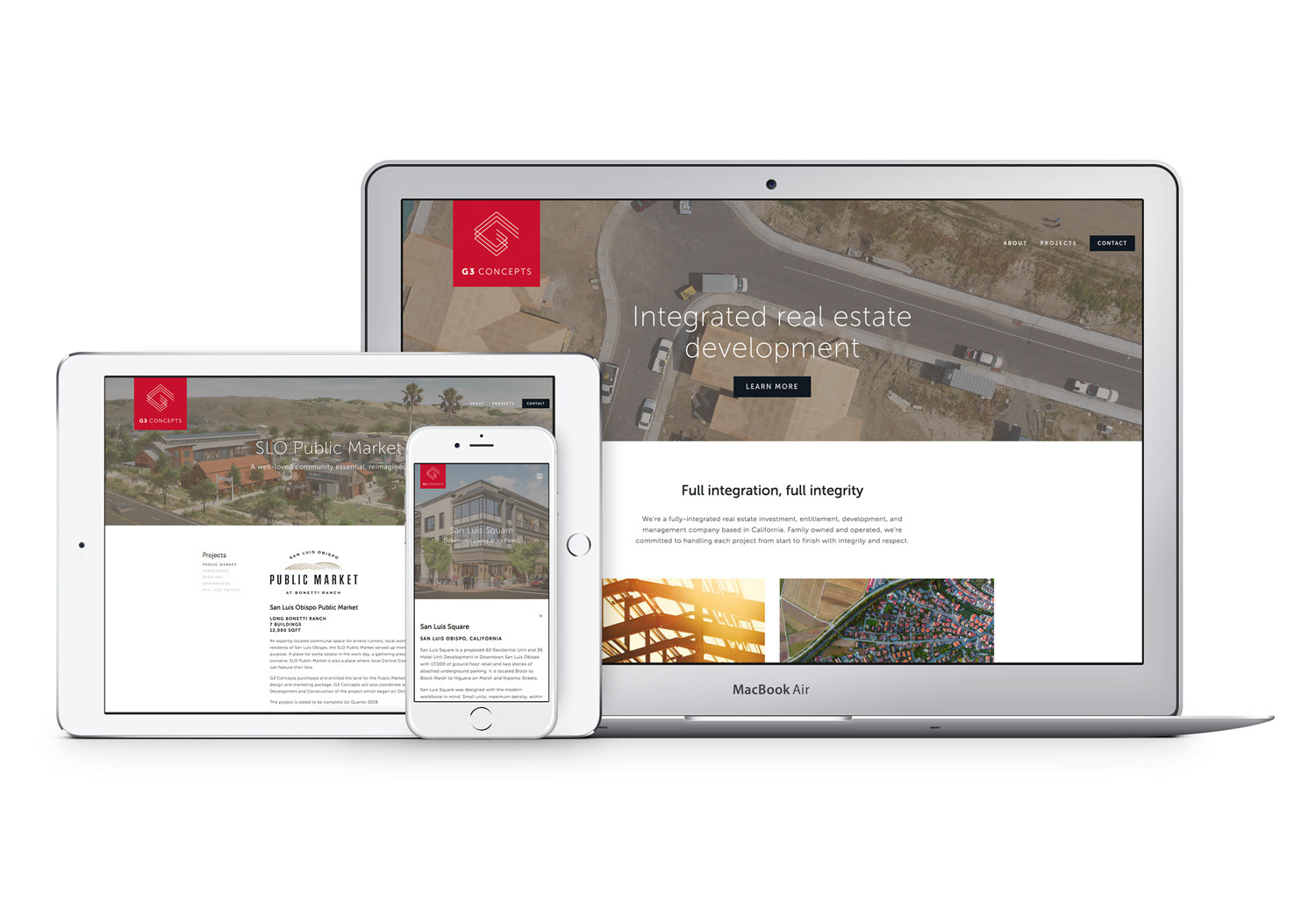
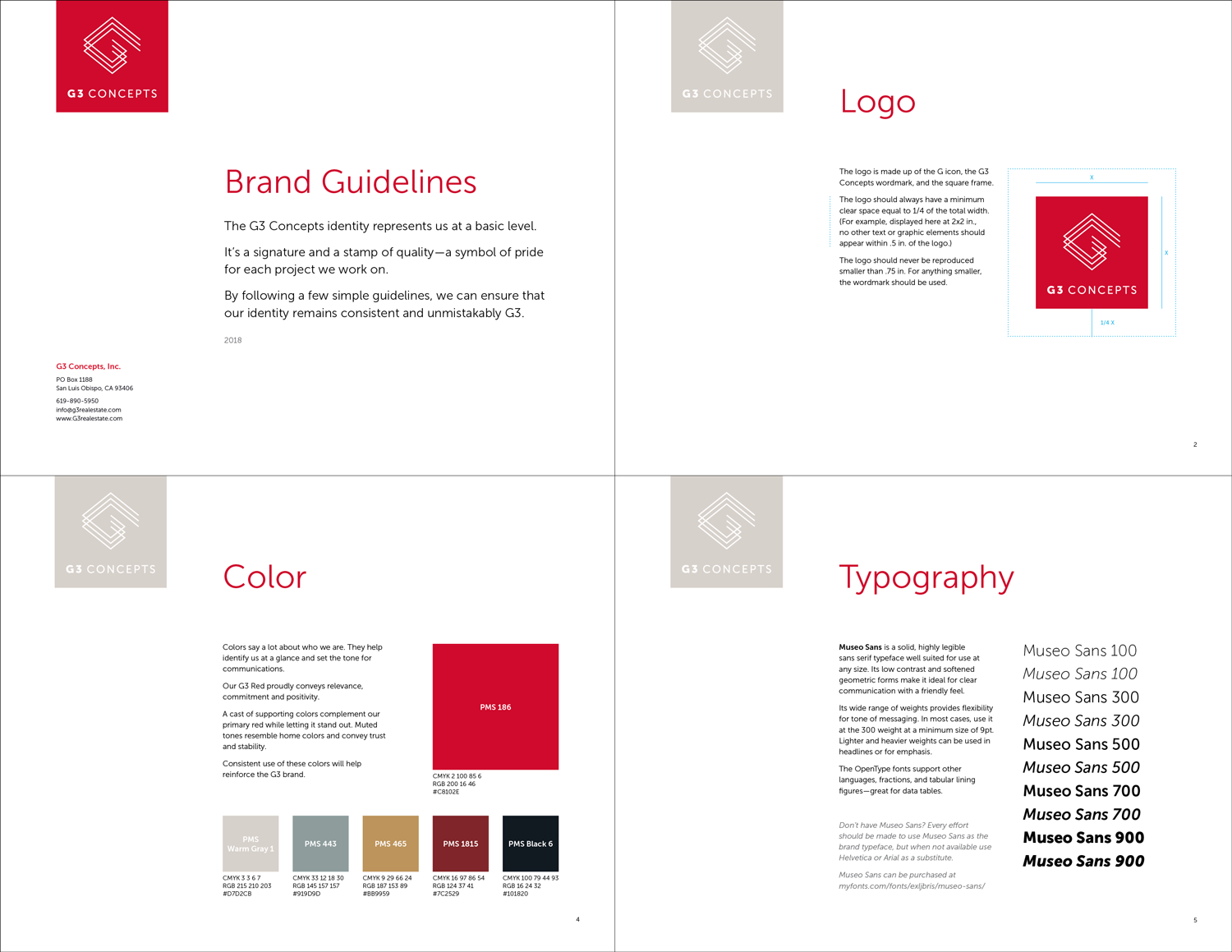
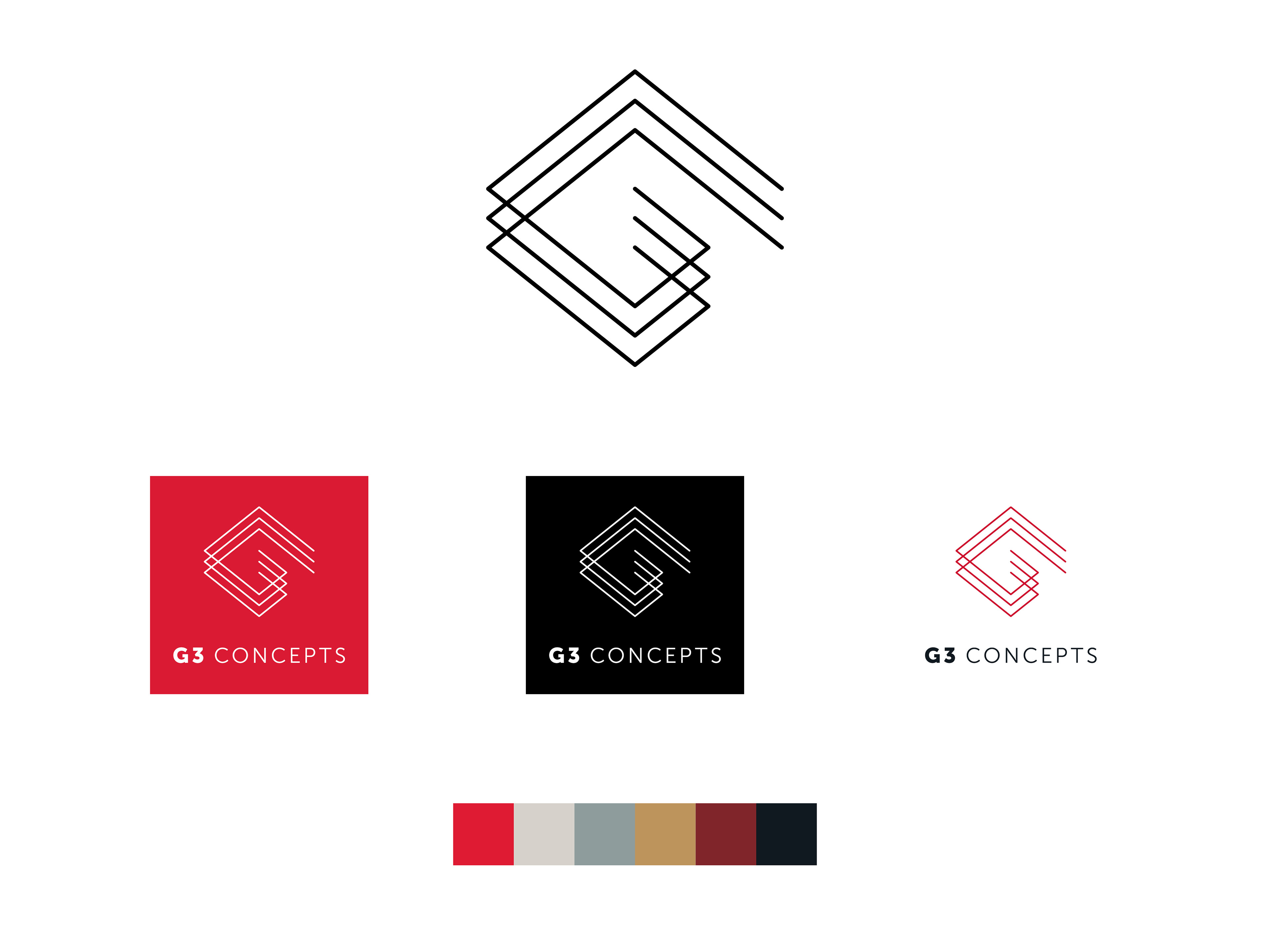
G3 Concepts Brand Identity
In the busy world of real estate, G3 Concepts does a little bit of everything. From entitlement to development and construction to sales, the third-generation family business needed a competitive brand identity that represented each service equally.
The solution was an abstract, custom letter G stacked three times as if rising up from the foundation. Red was chosen for its vitality and to stand out in a marketplace of neutral and blue/green schemes of architectural renderings and property images.